Only Farmers
A farmer network with a brand identity and practical guidelines made for the people using it
Client
Only Farmers
Sector
Agriculture network
Stage
Established network
Scope
Brand identity + guidelines


The stakes
Only Farmers appears in community posts as well as its own channels. The identity needed to stay clear when farmers applied it to their own photographs and content.
The read
The audit found inconsistent typography and assets. The guidelines needed to work for people using the brand without a designer alongside them.
The move
We designed the identity for everyday use: a small set of logo options, defined color roles and clear typography rules, supported by practical examples.
Only Farmers is a UK network based in the Cotswolds, connecting people with farms and farmers with each other. We developed its brand identity and interactive guidelines so the people using it could create consistent posts, print materials and digital content.
View the interactive brand guidelines →
A brand used across the network
The audit found inconsistent typography and assets across the brand. The challenge was making the rules useful to the people applying them.
Farmers would use the identity on their phones, over their own photographs and in their own posts. The system needed clear choices and accessible assets, with enough flexibility for each farm to retain its character.
Designed for the people applying it
We made ease of use a design requirement. A small set of logo options, practical examples and clear minimum sizes would help someone choose the right asset without working through a long approval process.
The brief asked for farmers to feel like celebrities. We used that as a test for the identity: would someone want to put it on their own post? The brand needed a confident presence and a simple way to apply it.
The name already carried a direct, playful tone. We used it to frame the network around farmers speaking for themselves, with a visual identity they could use in their own content.
One constraint, applied to every rule
We tested the rules against a common use: a small mark or short line of text placed over a photograph by someone who is not a designer.
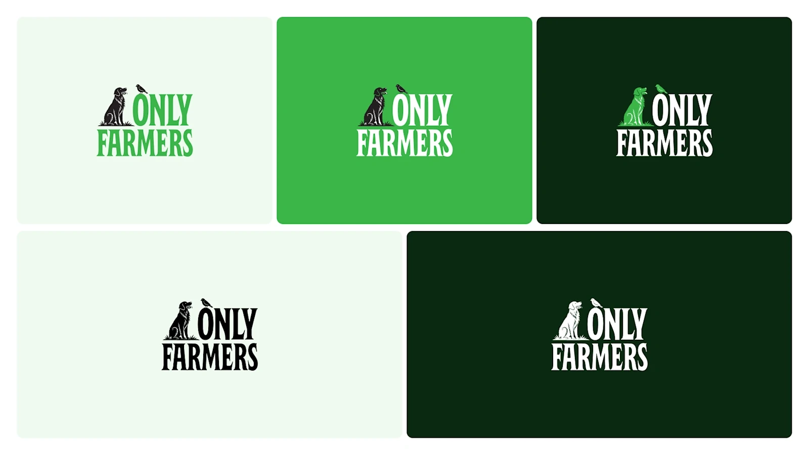
The logo has three colorways: green on light backgrounds, white on dark, and solid black for one-color printing. Clear space follows the cap height of the F. At smaller sizes, a submark replaces the full lockup.
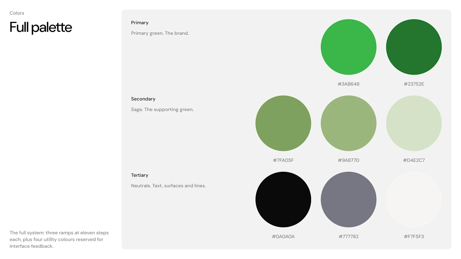
Kelly green leads, while sage supports larger areas and photography overlays. Three eleven-step color ramps provide the range, with four utility colors reserved for interface states.
The neutral ramp draws from colors already present in the mark and website. The guidelines give those colors defined roles so each new application starts from the same palette.
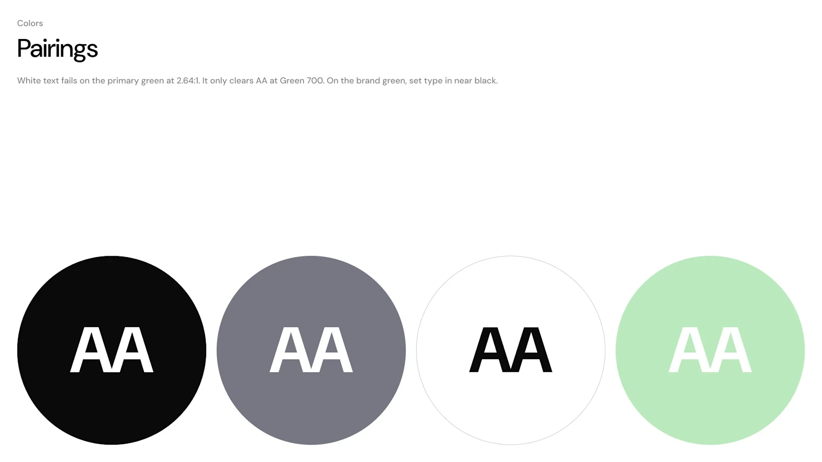
Contrast guidance defines which text and background colors work together. Near-black text pairs with the primary green, while white text is reserved for darker greens.
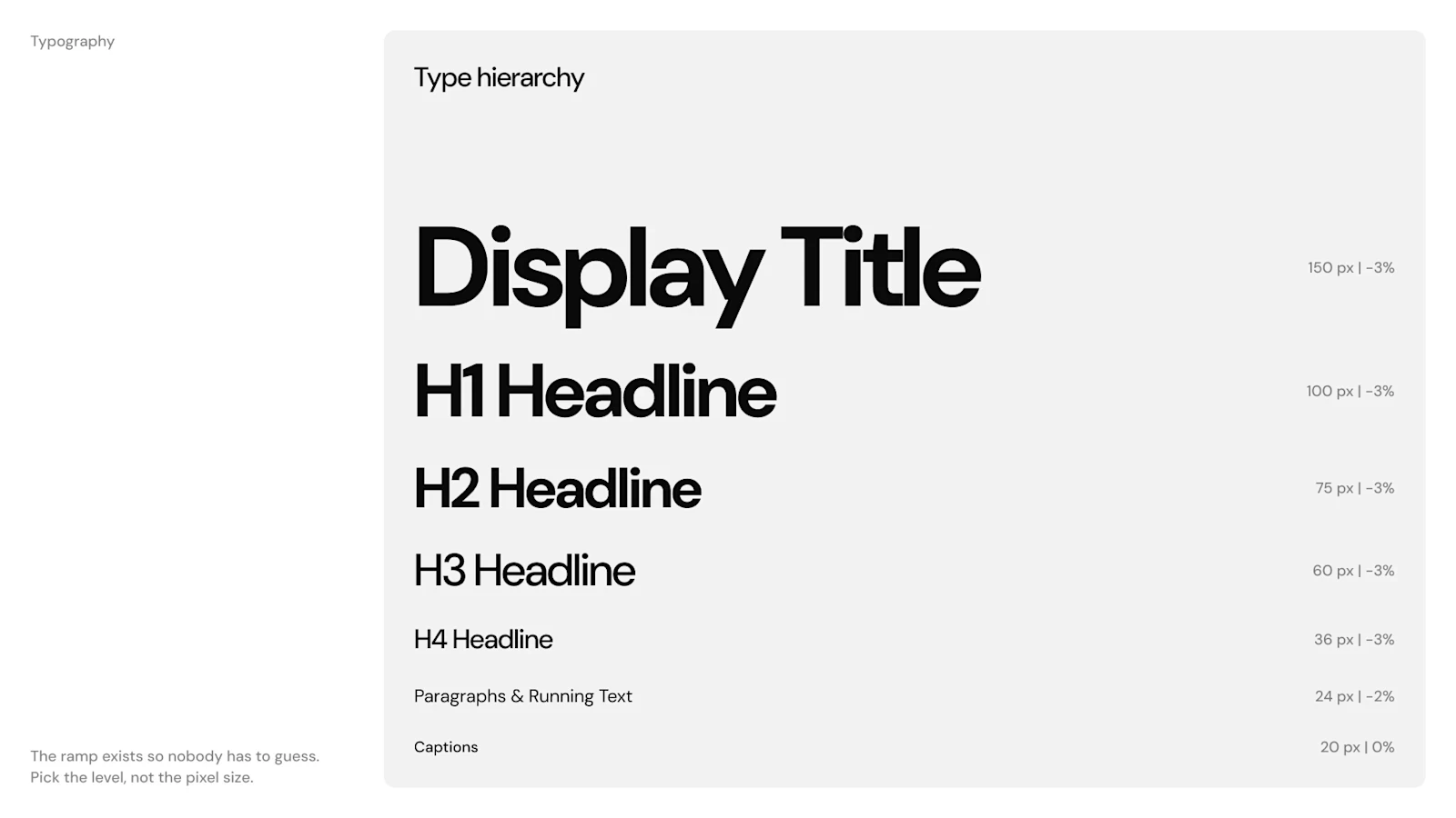
DM Sans provides the type system: Medium for headings, Regular for body copy and Bold at display sizes. A seven-step scale sets the sizes. Weight creates emphasis, keeping text consistent across posts and longer documents.
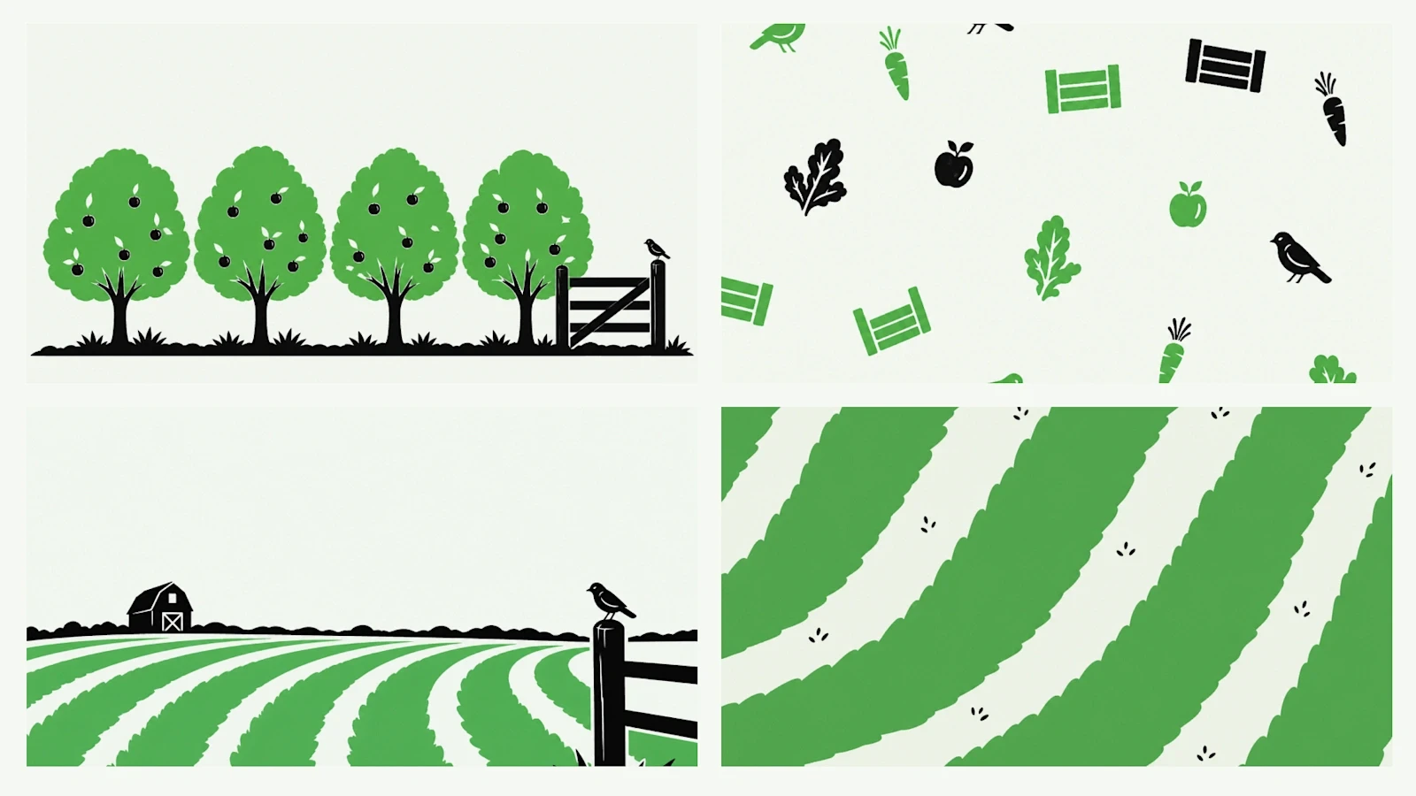
Flat two-color illustrations draw on field patterns, orchard rows, barn silhouettes and produce. Simple shapes keep them legible on a phone screen and practical for print.
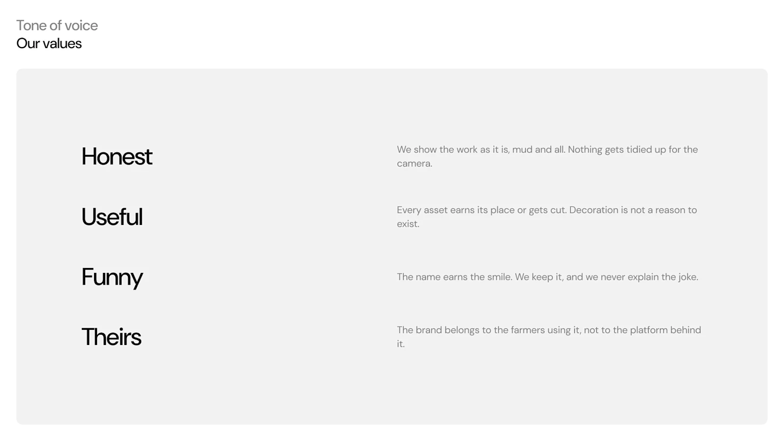
Four values guide the voice: Honest, Useful, Funny and Theirs. They keep the language direct and give farmers room to speak in their own words.
Shared color variables keep the Figma system consistent. Primitive colors and semantic roles let the team extend the identity without redefining the palette.
Applied
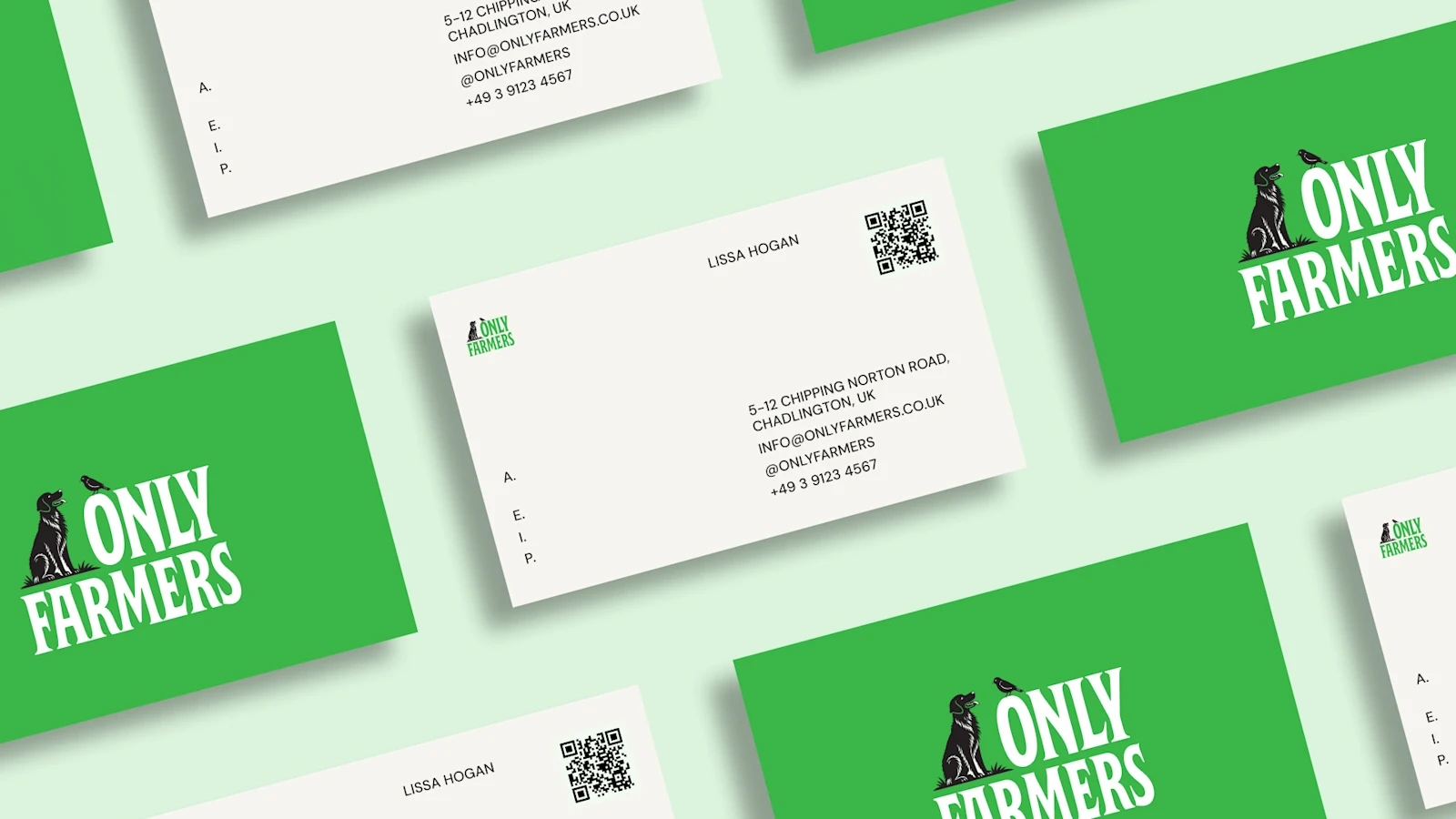
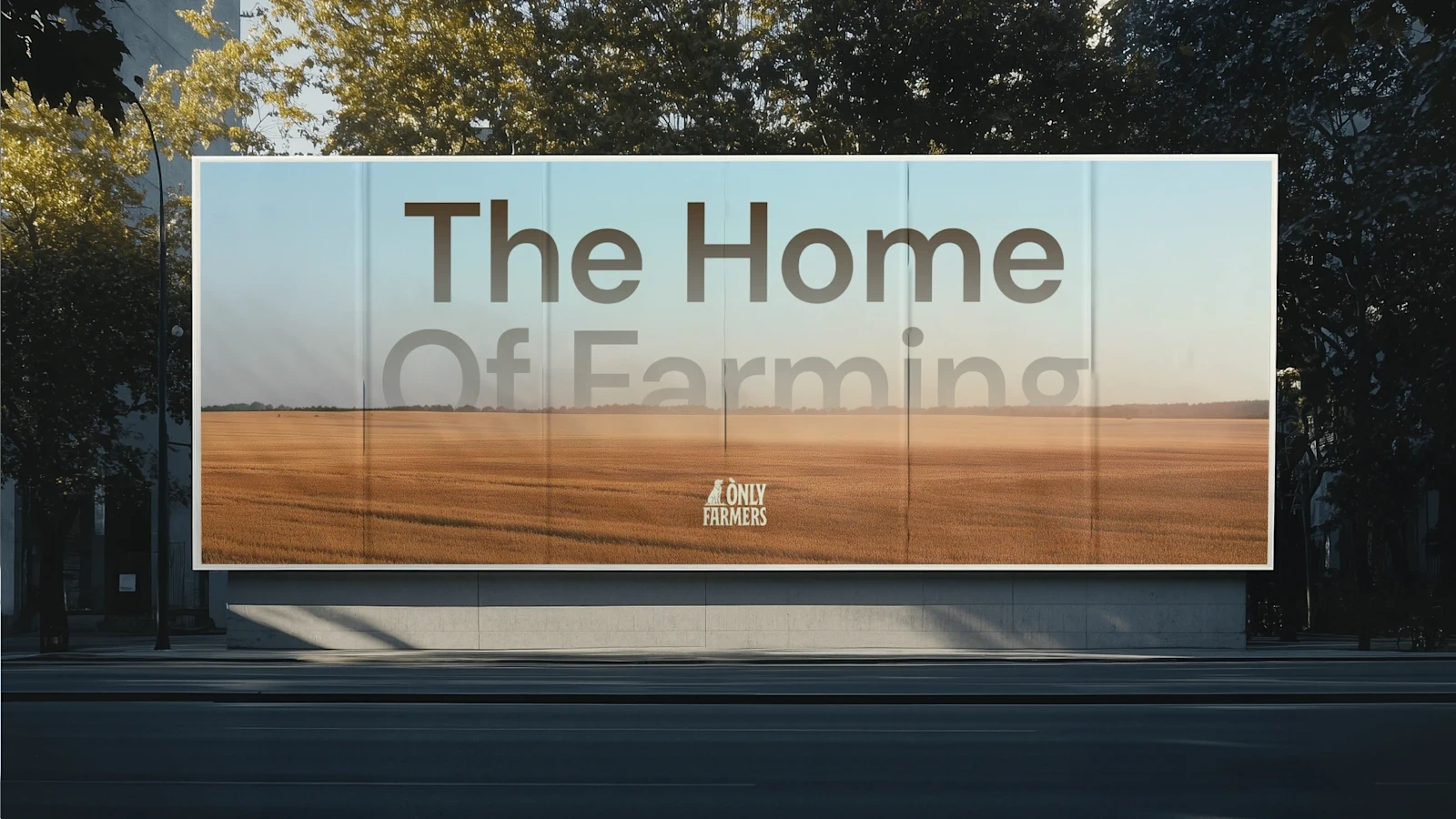
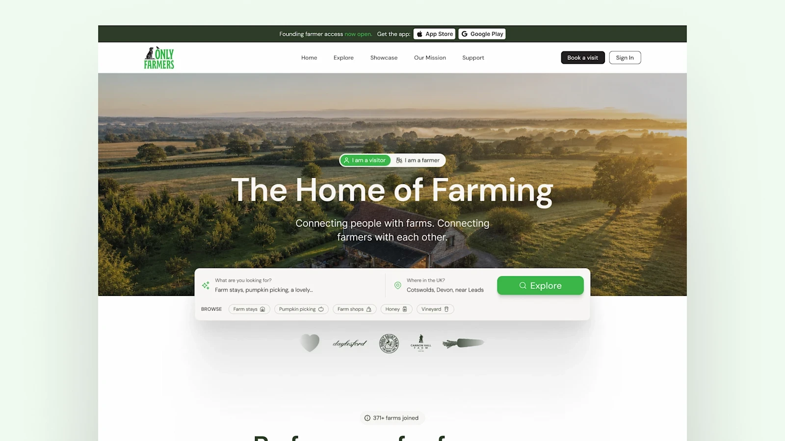
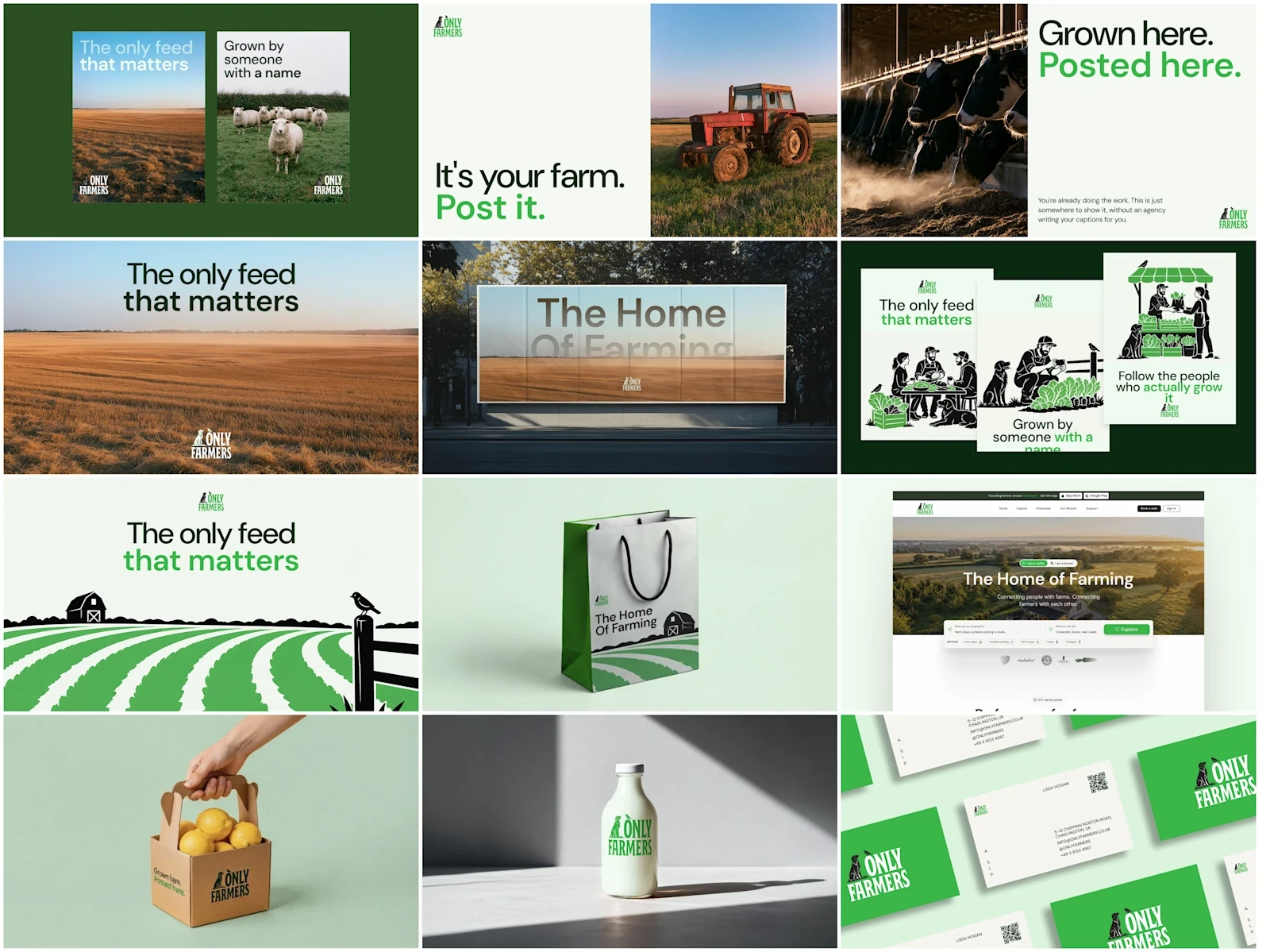
The applications show the system across business cards, letterhead, packaging, posters, out-of-home, social profiles and website design, with photography and iconography guidance.
What changed
The team now has a defined set of logo options, a color hierarchy, contrast guidance and a typography scale. These decisions are documented together, making the correct assets and rules easier to find.
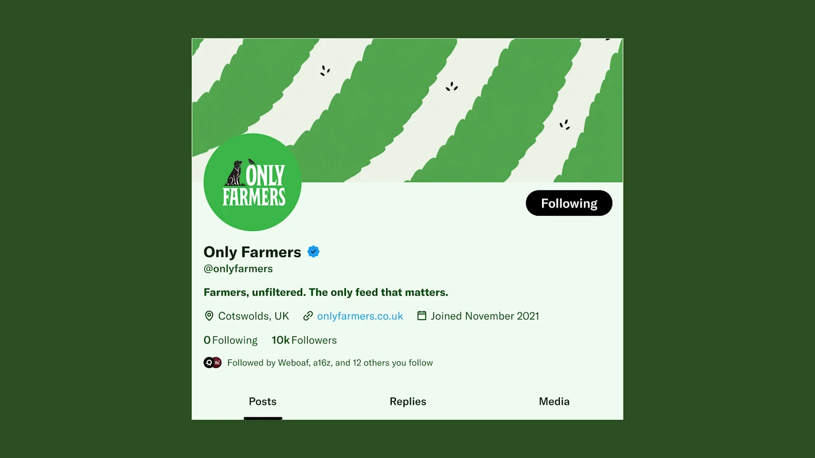
The farmer marketing kit extends that guidance into assets people can add to their own posts. It gives the network a consistent presence while leaving the content in the hands of its members.
Built for everyday use
The identity is designed to work in the places the network actually appears: a farmer’s post, a profile image, a printed card or a website. That practical use shaped the rules throughout.
The system
Brand identity and interactive guidelines with logo, color, typography and illustration rules, plus assets for community and marketing use.
Continue exploring