Augment MBA
A more focused landing page for an alternative MBA
Client
Augment MBA
Sector
Education
Stage
Live product
Scope
Landing page design + build
How much time
3 weeks



The stakes
Augment’s landing page needed to present its instructors, curriculum and membership options in a more focused way.
The read
Twelve sections carried similar visual weight. Multiple typefaces and competing accents made it harder to see which information mattered most.
The move
Simplify the typography, reserve warm gold for the calls to action and alternate immersive sections with compact information layouts.
Augment offers an alternative to the traditional MBA, with instructors including the founders of Wikipedia, YouTube, Shazam and Eventbrite. We redesigned and built its landing page in Framer.
The original page brought courses, benefits, testimonials and pricing into twelve sections. We focused the redesign on helping prospective members understand the offer, assess the curriculum and compare membership options.
The problem
Multiple typefaces, a bright green accent and sections with similar visual weight made the page feel busy. The instructor roster and curriculum needed a clearer hierarchy within the longer page.
The design brief called for a more premium presentation: “Premium. I want it to feel premium.” We translated that request into a more restrained palette, simpler typography and greater contrast between the roles of each section.
What we did
We simplified the visual system and reduced repetition in the page structure.
We replaced the green accent with warm gold reserved for calls to action. A single typeface established hierarchy through size and weight, and two overlapping sections were consolidated to bring the page from twelve sections to ten.
The new layout alternates full-width sections with more compact informational sections. That variation gives the instructors, curriculum and membership details distinct places in the sequence.
Refining the details
During iteration, we reduced the gold treatment to the buttons, removed instructor filters that would be static in the build and simplified the membership comparison and introductory cards.
Each change brought the design closer to what the finished page could clearly explain and support.
A clear path through the offer
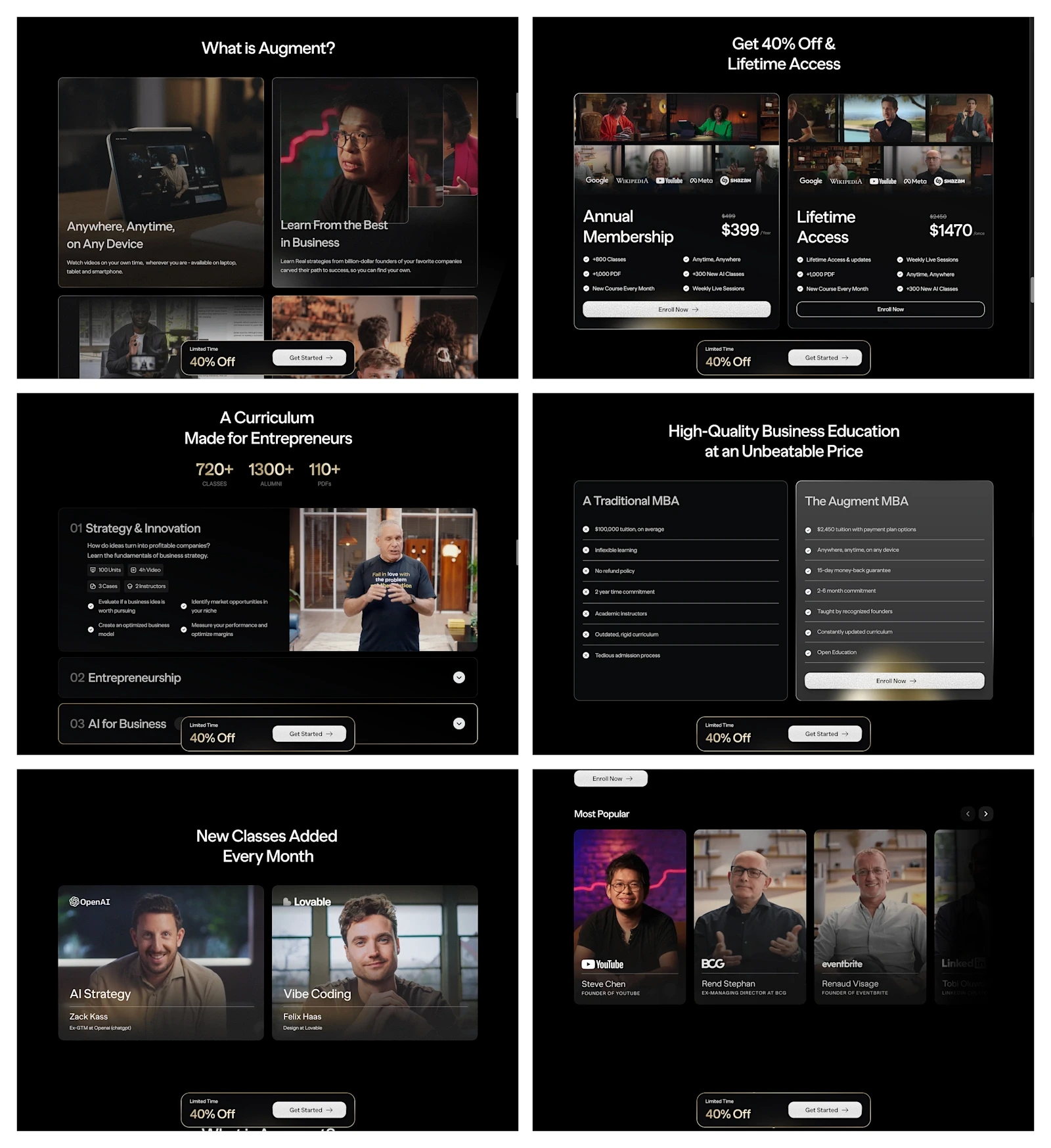
The hero introduces the program, the instructor carousel presents the roster and the curriculum accordion lets visitors inspect the content. The membership comparison and FAQ support the decision, while a sticky call to action keeps the purchase route accessible.
Result
The project moved from the first design to an approved Framer build in three weeks, across three rounds of iteration. The completed page combines the instructor roster, curriculum and membership options in one consistent layout.
A restrained visual system gave each part of the offer a clearer role, from the first introduction to the membership decision.
The system
A Framer landing page with an instructor carousel, curriculum accordion, membership comparison, FAQs and a persistent purchase path.
Continue exploring