Tithe
An iOS focus app with three consequence paths, brought into 35 screens that make each choice and confirmation clear
Client
Tithe
Sector
Consumer iOS app
Stage
Pre-launch
Scope
iOS app UI/UX — 35 screens
How much time
6 weeks


The stakes
The app asks users to make choices with financial or fitness consequences. Each screen needed to communicate the choice, the next action and the resulting state clearly.
The read
The founder had already defined the brand’s photography, colors and mark. We needed to translate that direction into a usable interface, including the moments where users authorize a consequence.
The move
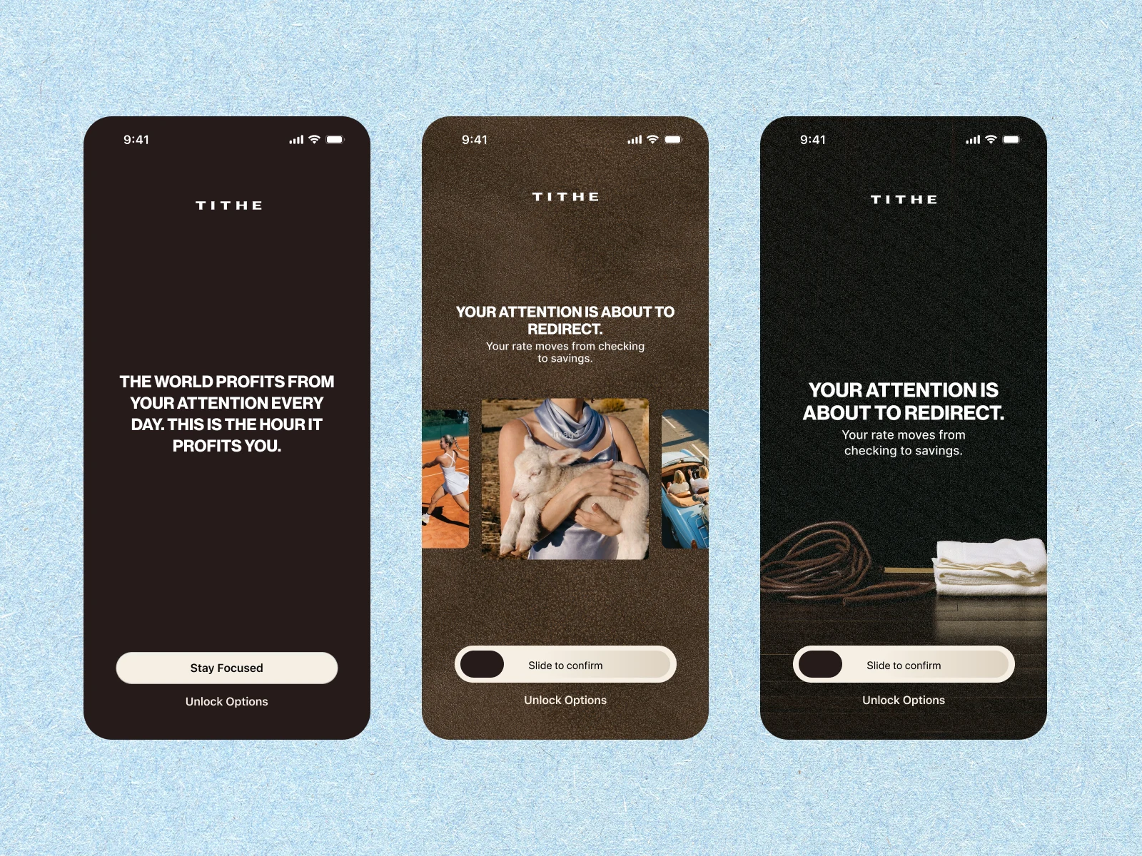
We made the exit a deliberate sequence: blocked-app prompt, confirmation and response. Light and dark surfaces distinguish everyday navigation from decisions that need closer attention.
Tithe is an iOS app that connects focus to a consequence chosen by the user. Its three paths link blocked-app access to saving, donating or a fitness goal. We designed the interface across 35 screens, carrying the founder’s existing identity into the product.
The central design question was how to make those consequences clear at the moment a user decides to break focus.
An existing brand, ready for the interface
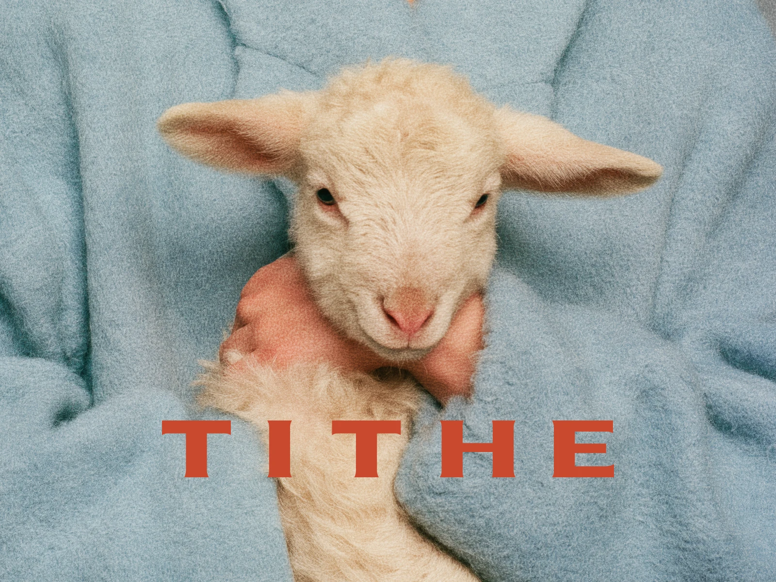
The founder arrived with a defined visual direction: 90s editorial photography, powder blue, espresso and a hand-drawn lamb mark. Our work translated those elements into the screens, states and interactions needed for development.
The financial paths ask users to connect an account and authorize transfers. The interface therefore needed to explain what each action meant, show the destination of the money and give confirmation a distinct place in the flow.
Give the exit a clear sequence
Breaking focus is a central part of Tithe’s product idea. We treated the exit as a complete sequence, with space to understand the consequence before committing to it.
The sequence connects three states:
The shield appears when a user opens a blocked app. A single editorial line remains consistent throughout the session.
The confirmation explains the action and uses slide-to-confirm to make the commitment deliberate.
The consequence screen gives the action a dedicated response, separate from the confirmation step.
Starting a session remains quick. Leaving one introduces a deliberate confirmation step because the choice carries a consequence.
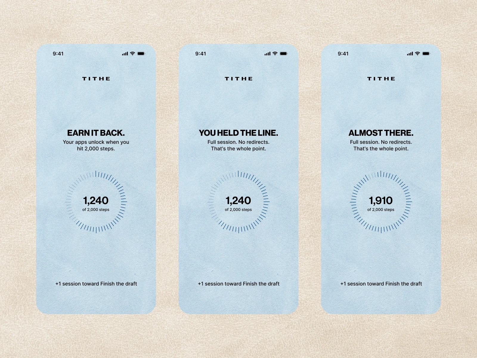
Completion received the same attention. A short message acknowledges a finished session, with restrained typography keeping the focus on what the user accomplished.
Light for daily use, dark for decisions
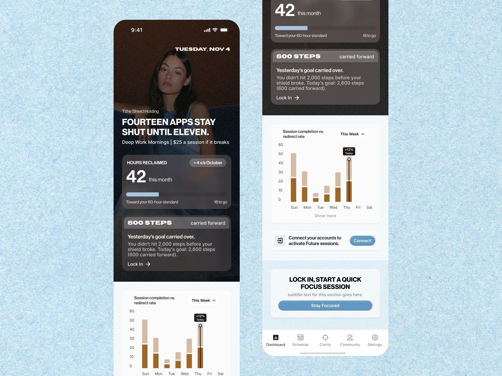
The dashboard, schedule and Clarity screens use light, editorial surfaces. The shield, redirect confirmation and paywall use deep espresso. That change in tone separates everyday navigation from moments that require closer attention.
Carry the idea through the product
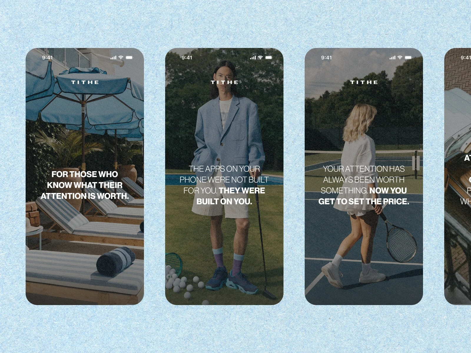
Onboarding introduces the idea in five screens. Full-bleed photography and one thought per screen establish the tone before configuration begins. Accounts and permissions are deferred to the first session.
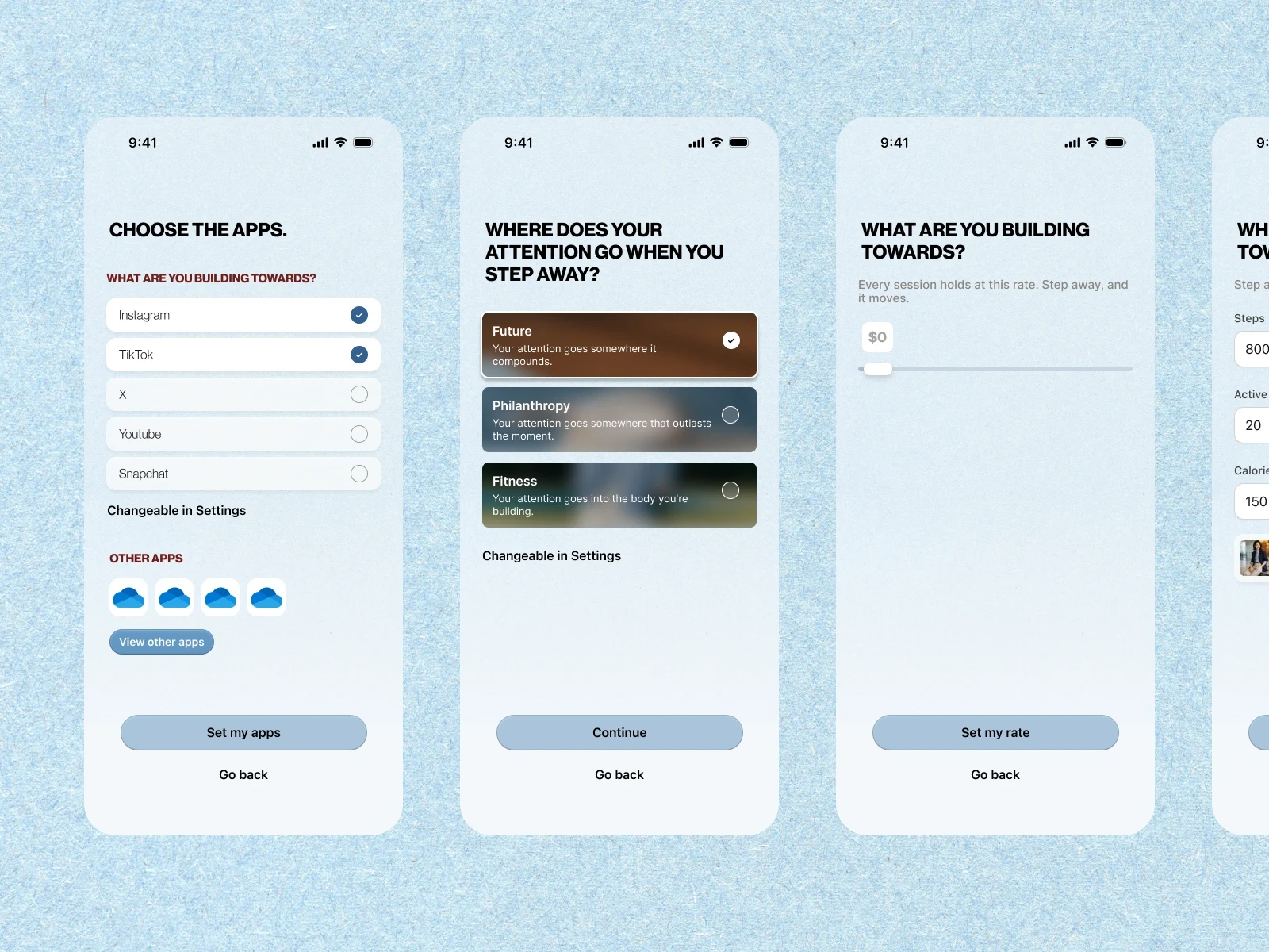
The path selection makes the commitment explicit. Future, Philanthropy and Fitness receive equal weight, with no preselected option. Each choice leads to its own setup and consequence flow.
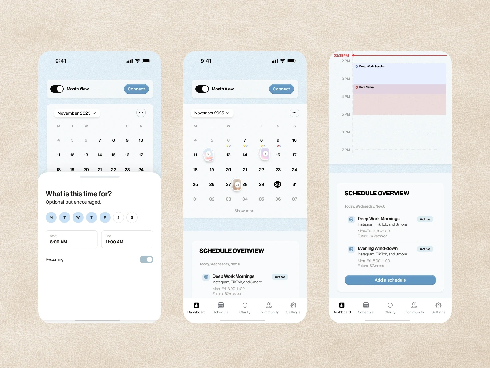
The dashboard explains the active session. It shows which apps are blocked, when the session ends and what happens if it is interrupted. Cumulative focus time sits below, with session start one tap away.
Clarity connects sessions to personal goals. An attention audit and behavior summaries help users review how their focus time relates to the work they want to do.
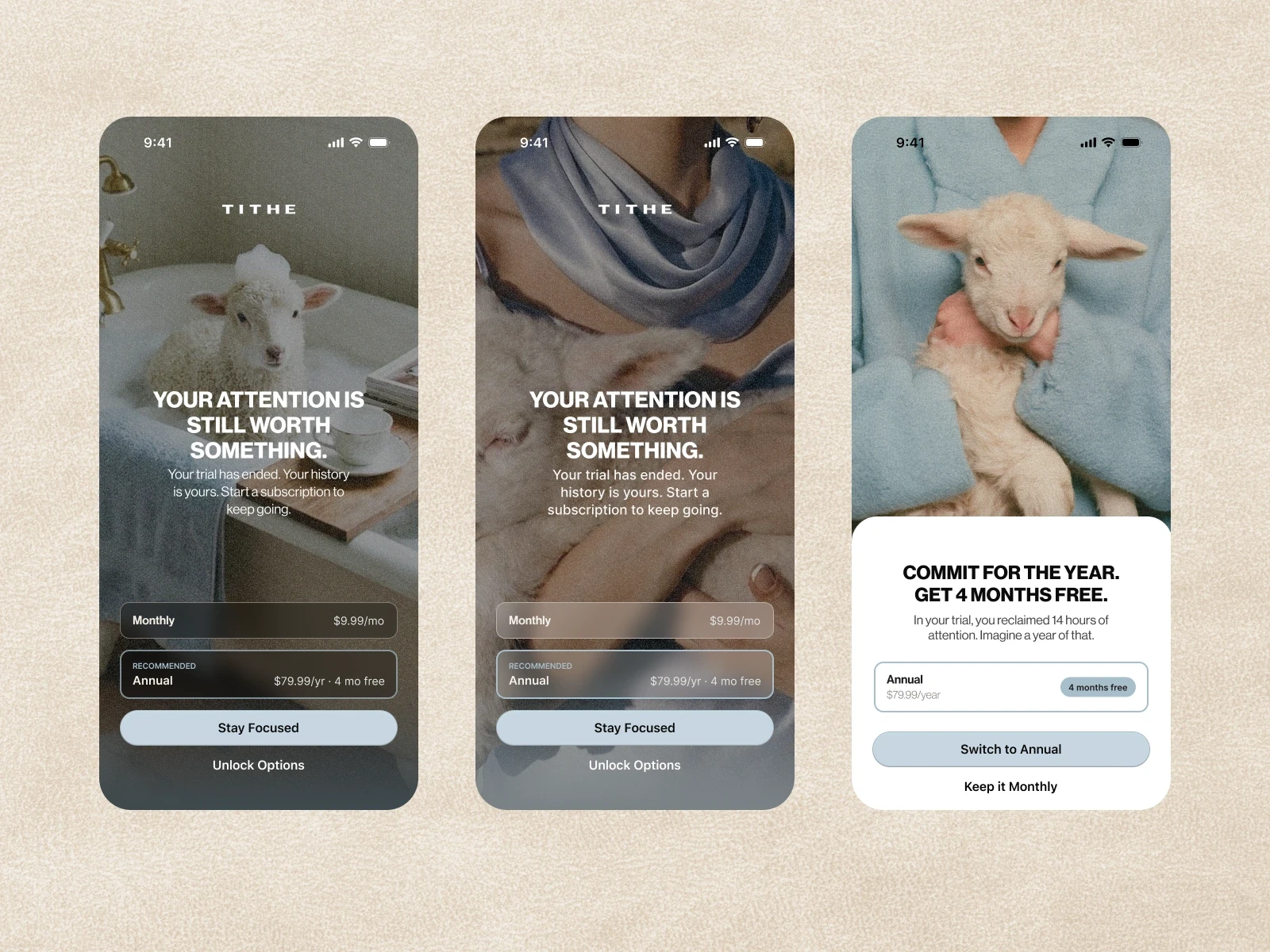
The paywall presents the next decision clearly. Both plans remain visible when the trial ends, alongside the reassurance that the user’s history is preserved.
Designing for platform constraints
The blocked-app shield carries the identity through a limited set of elements: an icon, a short line and two buttons. Fitness screens include progress toward an unlock threshold. Financial confirmation templates reserve space for authorization wording and distinguish a submitted action from completed settlement.
A consistent photographic direction
Direct flash, film grain and tactile materials carry the founder’s editorial direction through the app. Powder blue and espresso connect the photography to the interface, while the lamb mark gives the identity a recognizable point of reference.
Ready for development
The work moved from kickoff to a handoff-ready Figma file in six weeks, across three review rounds. The handoff included 35 screens, mapped states, screen specifications and a reusable visual system for continued development.
The result is a consistent interface for a specific product idea: each focus path has its own setup, confirmation and response, all built from the same brand.
The system
The handoff includes 35 screens, mapped states and reusable UI components, carrying the founder’s brand through onboarding, session setup and all three consequence paths.
Continue exploring